…Carol Padberg
Here’s her artist’s statement:
Using the “modernist DNA” of typography fonts such as Bauhaus, Futura, and Helvetica, I create visual improvisations. I use fragments of found typography to take apart and put back together language. My work employs traditional painting media (encaustic and polymer resins) as well as materials that extend the medium of painting (adhesive vinyl, flocking and metallic films). Often I choose materials with which I can create a tension between the flat graphic voice of type and the fluidity of paint and handwriting. Sometimes comical, sometimes minimal, these images ask questions about design, nonverbal language, and the modernist lineage of abstract painting.
I’m liking her collage especially the Helvetica at sea series:
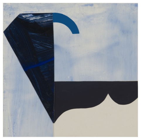
Helvetic at Sea #8
(via Two Coats of Paint)