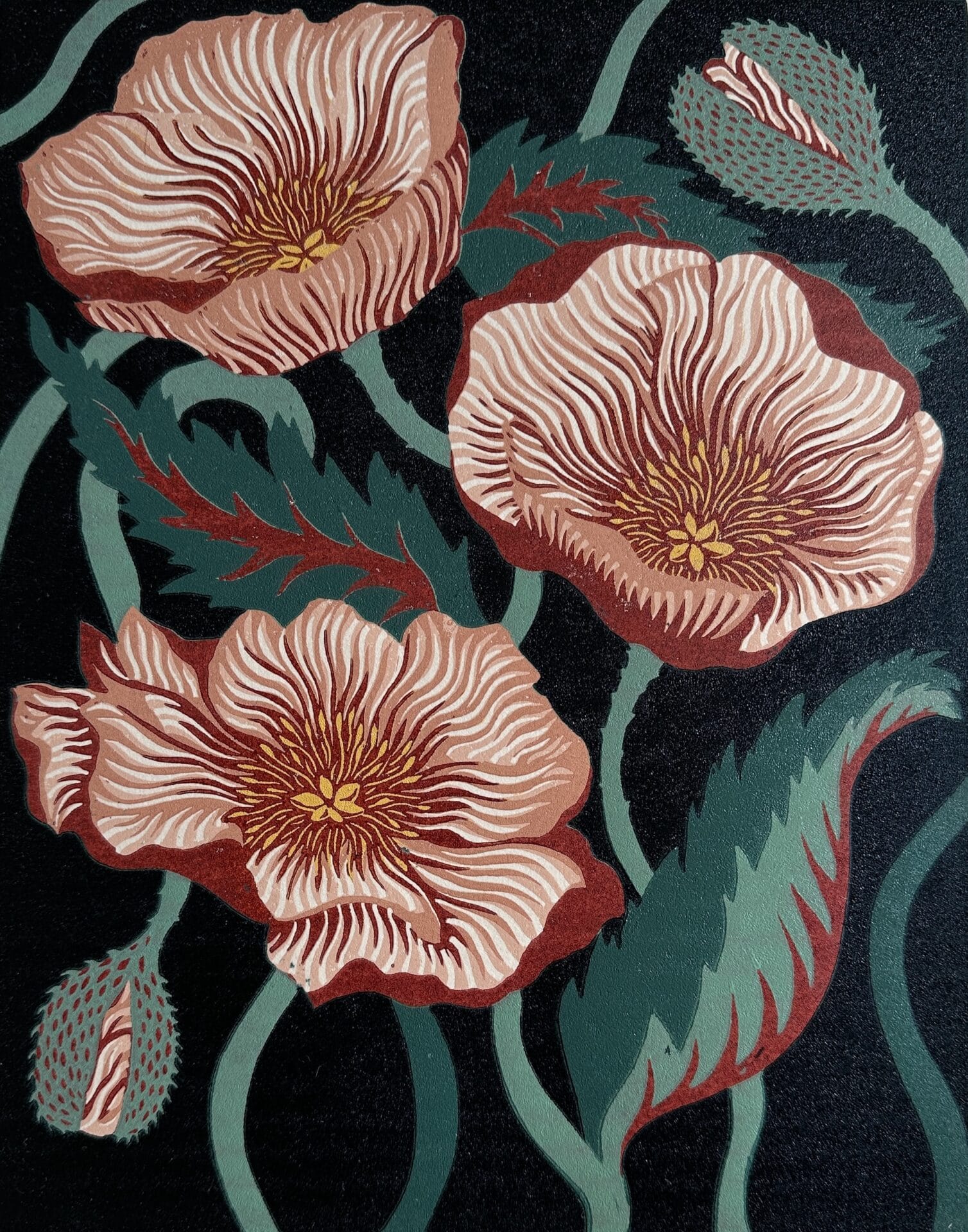
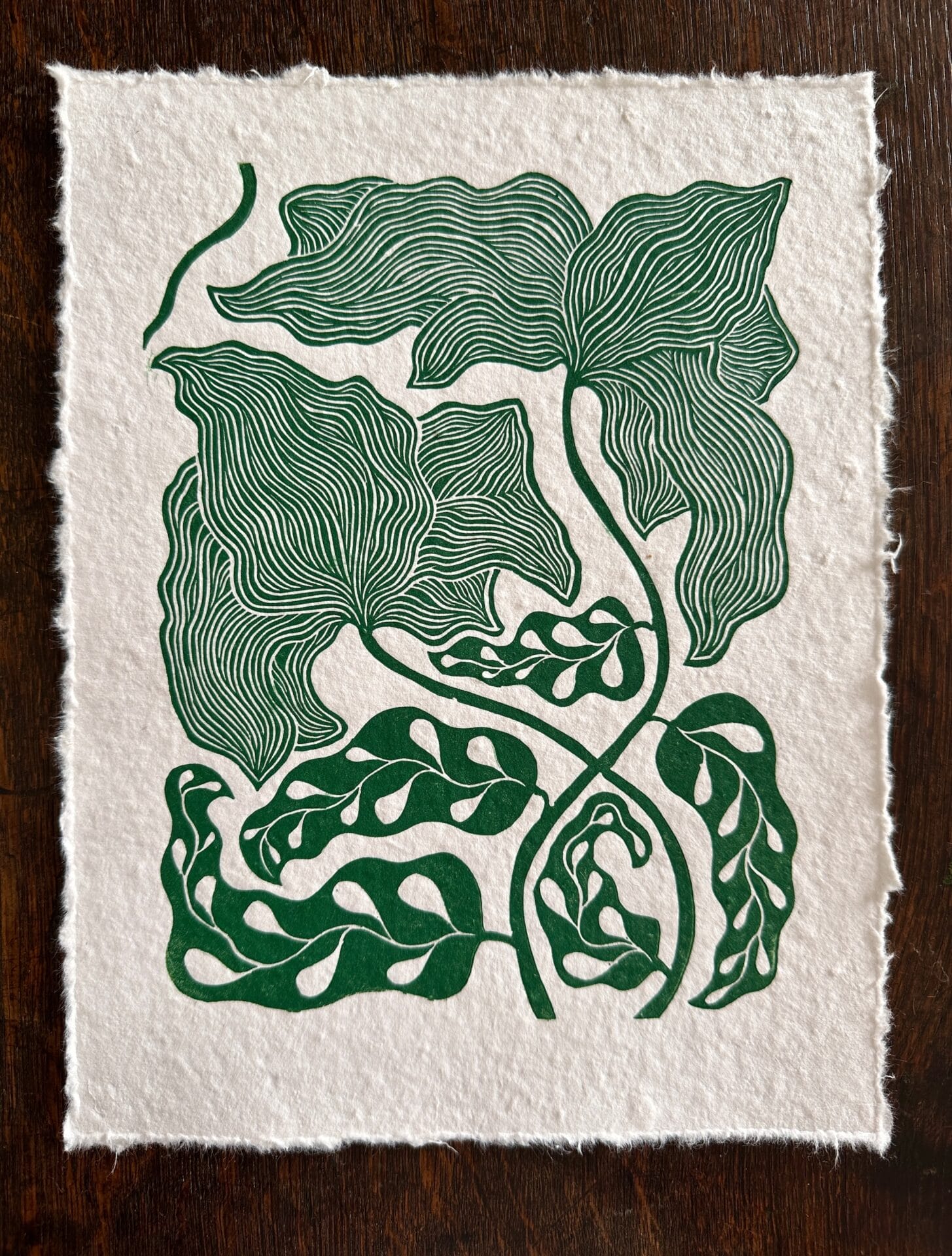
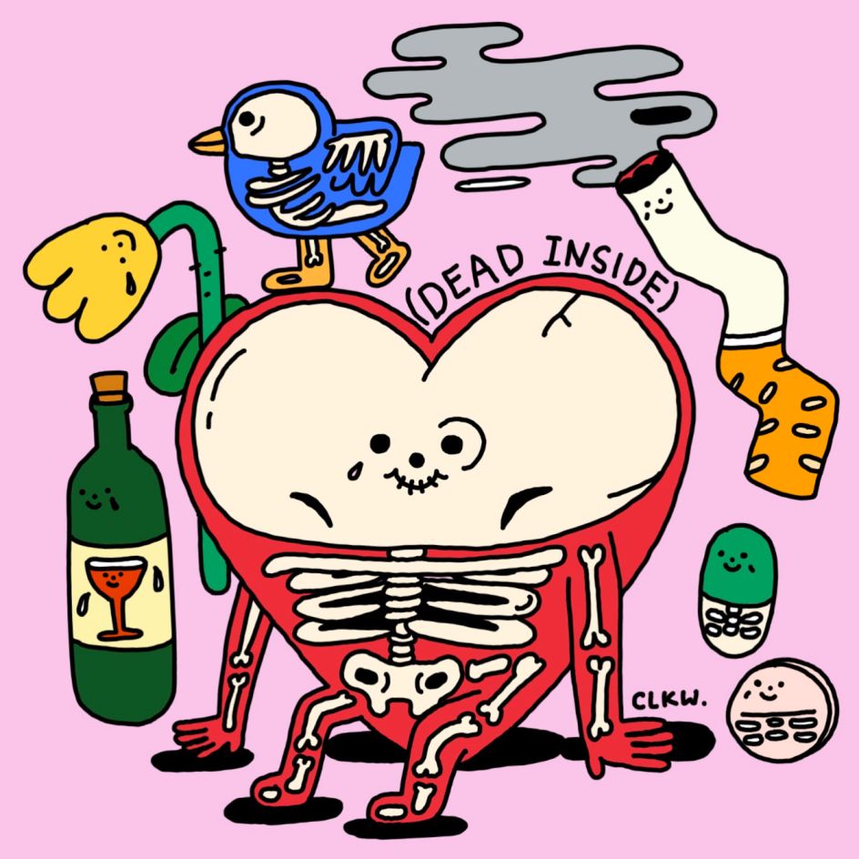
Grace Gillespie grew up in an artistic household, but she resisted pursuing visual art at first, especially printmaking, because it was something both of her parents excelled at. “I guess I wanted my own ‘thing,’” she tells Colossal, which for most of her twenties was music. Then, during the pandemic, she found herself furloughed, disillusioned with the music industry, and back at her parents’ home in Devon, England.During her six-month stay, Gillespie had access to a large etching press belonging to her mother, artist Sarah Gillespie. “I decided to try my hand at linocut and was immediately very addicted!” the artist says. “I was also just incredibly lucky that (my parents) had a lot of old lino and tools lying around—a bit ancient and rusty, but they did the trick.”
Category Archives: Art
Juxtapoz Magazine – A Portfolio: Rain Szeto
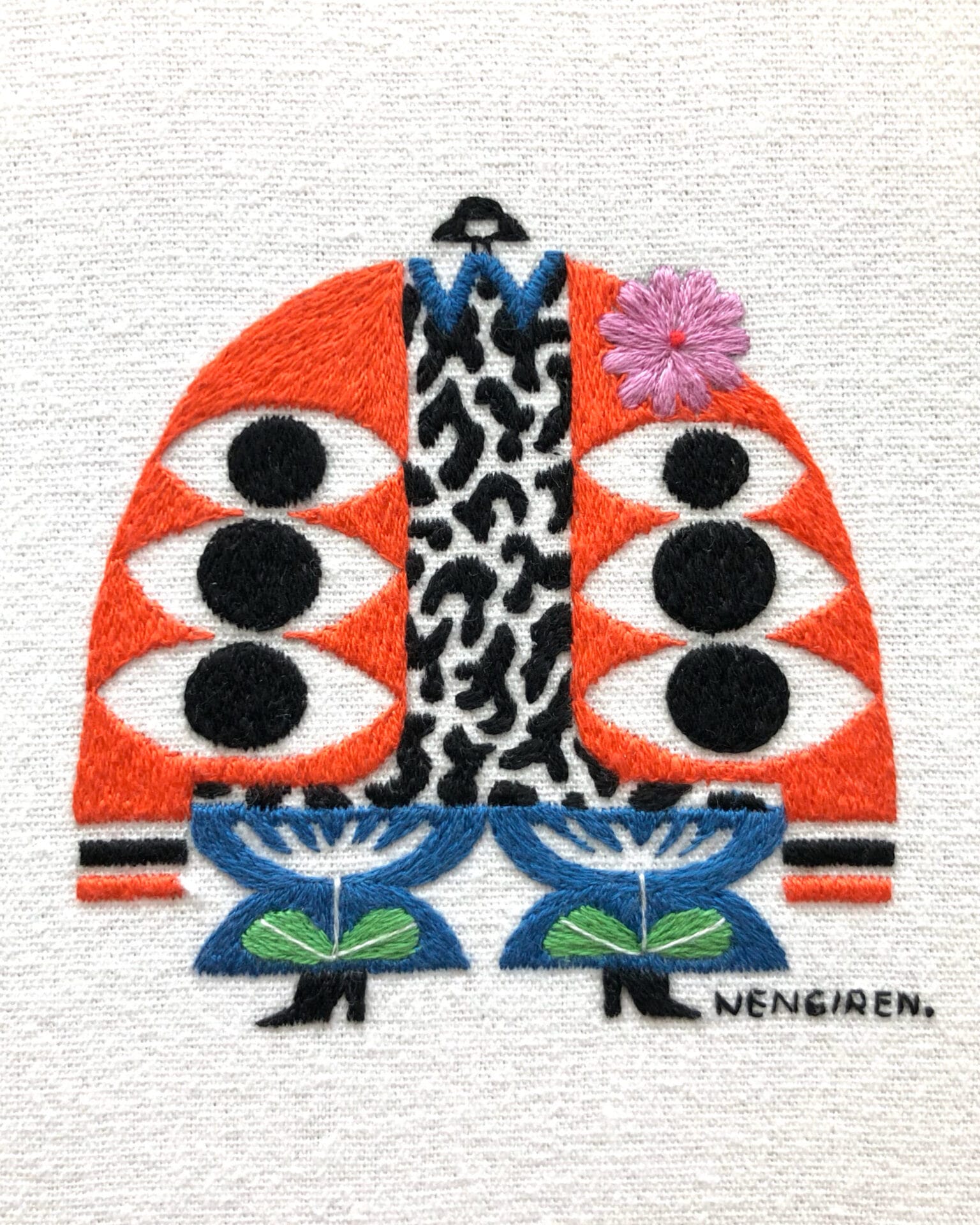
Nengiren’s Embroidered Figures Embrace Feeling Carefree in Clothing — Colossal
Extravagant garments and quirky accessories adorn Nengiren’s collection of characters, encapsulating the boundless possibilities of fashion.
Source: Nengiren’s Embroidered Figures Embrace Feeling Carefree in Clothing — Colossal
Extravagant garments and quirky accessories adorn Irene Saputra’s characters encapsulating the boundless possibilities of fashion. The Tangerang, Indonesia-based embroidery artist, a.k.a. Nengiren, centers her work around dressing a nona kecil, or little woman.
Nengiren creates each character with no plan in mind. In the same way we might get dressed in the morning, she spontaneously designs the components of each figure’s outfit of the day, or “OOTD,” as she embroiders. She shares with Colossal:
Nona Kecil’s evolution mirrors my own journey as an artist. Initially, she adorned simple OOTDs with muted colors and straightforward patterns. However, the turning point occurred three years ago when I embraced motherhood. Balancing time between my son and art intensified my experimentation, leading Nona Kecil to explore more expressive and elaborate outfits.
With a graphic design background, illustration experience, and an interest in fashion, overarching motifs of typography, flashy patterns, color combinations, and texture guide the fabrication of each outfit, creating an array of harmonious looks. By way of vibrant threads and satin stitches, geometric shapes join together to construct a completely unique ensemble every time.
Celine Lau’s illustrations are a virtual hug designed to bring some brightness to your day | Creative Boom
The artist’s illustrations are a virtual hug designed to bring some brightness to your day.
Juxtapoz Magazine – “I tried to warn you” says Peter Frederiksen
In ‘Body Politic,’ Antony Gormley Traverses the Human-Built Landscape — Colossal
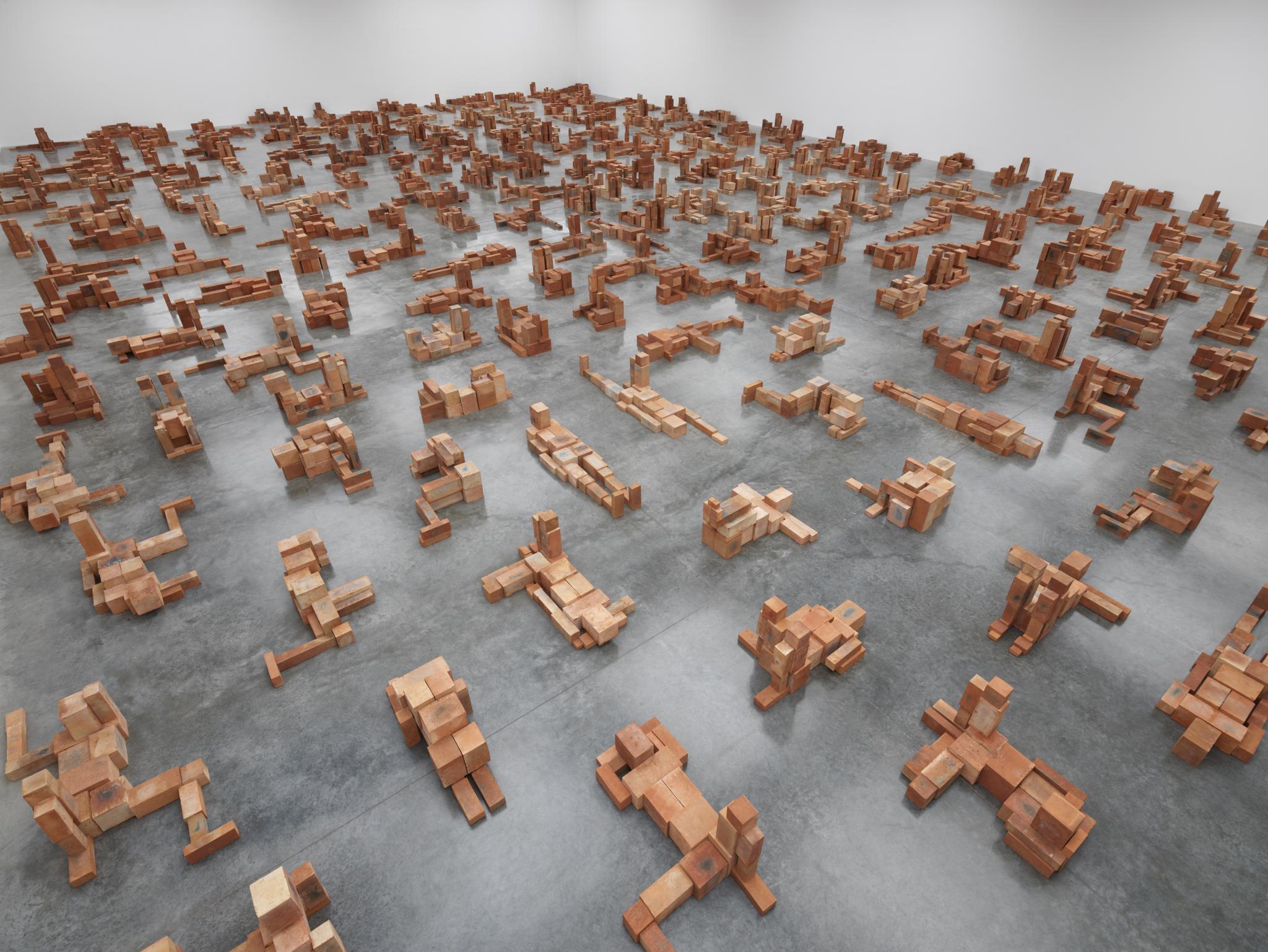
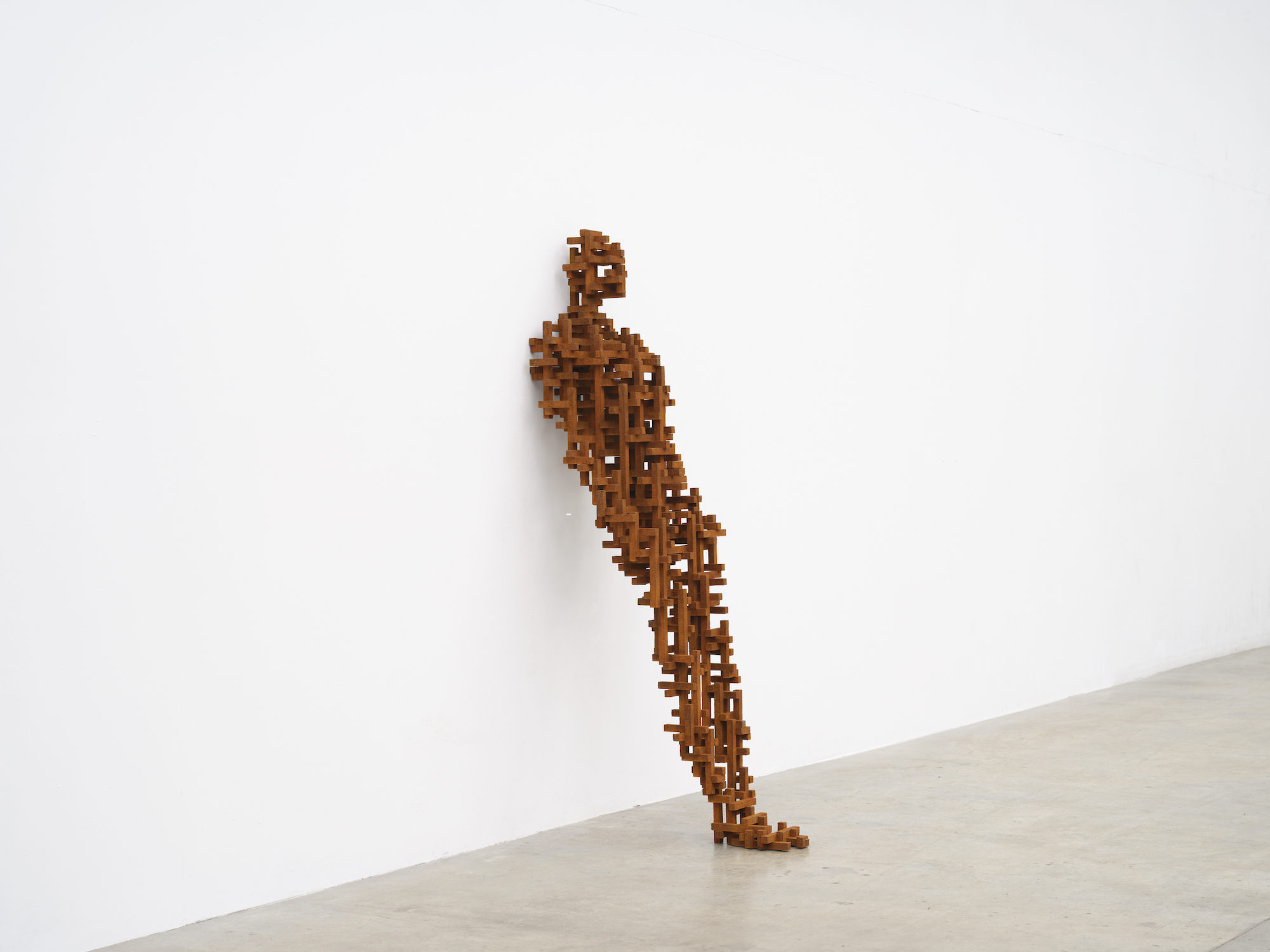
In ‘Body Politic,’ Antony Gormley investigates our relationship with industrial environments and the tension between migratory impulses and the need for refuge.
Source: In ‘Body Politic,’ Antony Gormley Traverses the Human-Built Landscape — Colossal
Monet’s Poplars
Source: Monet’s Poplars
Monet’s Poplars series
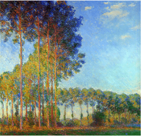
Apparently, Monet was at work on three different groups of the same trees (in the end, there were 23 paintings in all) each group with its own compositional format, when he learned the trees were going to be cut down. So, he did what any self-respecting art god would do – he bought them.
Monet made most of the Poplars paintings in the summer and fall of 1891. He saw them while rowing toward the “floating studio” he kept moored further up river. They stood single file along an “s-curve” in the river, and you just have to look at the paintings to see why he fell hard for them.
The trees, which belonged to the commune of Limetz, were indeed auctioned off for lumber. Monet therefore was forced into buying the trees to keep them standing long enough to finish painting them. Once he’d completed the series, he sold the trees back to the lumber merchant who wanted them.
Thus the world still has that graceful, elliptical geometry of light, leaf, breeze and branch, and we have one very focused and very successful never-say-die painter to thank for it.
Monday Musings — 11DEC23
As promised last week, the inks for that page.
And a fun video.
A Canadian study gave $7,500 to homeless people. Here’s how they spent it.
Because they were participating in a randomized controlled trial, their outcomes were compared to those of a control group: 65 homeless people who didn’t receive any cash. Both cash recipients and people in the control group got access to workshops and coaching focused on developing life skills and plans.
Separately, the research team conducted a survey, asking 1,100 people to predict how recipients of an unconditional $7,500 transfer would spend the cash. They predicted that recipients would spend 81 percent more on “temptation goods” like alcohol, drugs, or tobacco if they were homeless than if they were not.
The results proved that prediction wrong. The recipients of the cash transfers did not increase spending on drugs, tobacco, and alcohol, but did increase spending on food, clothes, and rent, according to self-reports. What’s more, they moved into stable housing faster and saved enough money to maintain financial security over the year of follow-up.
That’s it for this Monday. Remember to pull your pants up so you don’t trip over your legs.
