http://www.youtube.com/watch?v=qpunQZ4cUyI
A video for Andrea Dorfman’s song Art
Category Archives: Art
I’m also liking…
…Carol Padberg
Here’s her artist’s statement:
Using the “modernist DNA” of typography fonts such as Bauhaus, Futura, and Helvetica, I create visual improvisations. I use fragments of found typography to take apart and put back together language. My work employs traditional painting media (encaustic and polymer resins) as well as materials that extend the medium of painting (adhesive vinyl, flocking and metallic films). Often I choose materials with which I can create a tension between the flat graphic voice of type and the fluidity of paint and handwriting. Sometimes comical, sometimes minimal, these images ask questions about design, nonverbal language, and the modernist lineage of abstract painting.
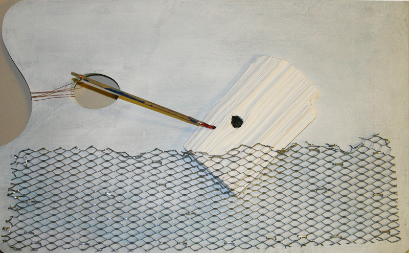
I’m liking her collage especially the Helvetica at sea series:
Helvetic at Sea #8
(via Two Coats of Paint)
Ric Stultz
Wow this guy is good.
From Anne Herbert
Peace and Love and Noticing the Details
There’s beauty, and there’s having rights. If people have rights, it’s easier for them to make their beauty.
Just a photograph
Antartica
The Drawing Room Show
Audrey Kawasaki posts some pics from her new group show The Drawing Room on her blog.
The thing that makes the biggest impression on me is the sameness, in theme and style, of the works in the show, which may just be because Audrey Kawasaki curated the show, but I’m thinking, not.
Ms. Kawasaki can draw beautiful women, I’ll give you that, but her style never seems to change, or grow. As for the other artists in the show, well, just look at the pics she shares. I mean there’s nothing wrong with stylistic sameness (for lack of a better word), especially in a group show of like minded painters, but I think this pulls it a little too far. It’s bland, and there’s hardly any fire in it at all. A couple of the artists do stand out some, but, where they do, it’s mostly in using a different technique, and that’s about it.
This is the up and coming of the art world, and they’re making money because they are popular (and good for them I say), but, the question is, why are they popular?
The answer is, one–that they have mastered their technique–beautifully–and two–they use very kitschy themes–beautiful women, cute children, childlike fantasies, etc.. It’s easy on the eyes, and easy on the brain. And people want easy.
This being a good, or bad thing, I suppose, depends on your idea of what art should be.
Let the fireworks begin. 🙂
Joan Miro
I’m thinking that Joan Miro may be becoming my new favorite artist (sorry Pablo). I wish now that I’d had time to visit his museum when I was in Barcelona a couple of years ago. That link above is to a slideshow essay of his work.
Red, Green, Blue–M&Ms
Just about my favorite candy, right there.
Richard Diebenkorn–notes on beginning a painting
- attempt what is not certain. Certainty may or may not come later. It may then be a valuable delusion.
- The pretty, initial position which falls short of completeness is not to be valued—except as a stimulus for further moves.
- Do search. But in order to find other than what is searched for.
- Use and respond to the initial fresh qualities but consider them absolutely expendable
- Don’t “discover” a subject—of any kind.
- Somehow don’t be bored—but if you must, use it in action. Use its destructive potential.
- Mistakes can’t be erased but they move you from your present position.
- Keep thinking about Pollyanna.
- Tolerate chaos.
- Be careful only in a perverse way.
From The Art of Richard Diebenkorn Jane Livingston, etal