Here’s a pic of a tutorial on drawing hands.
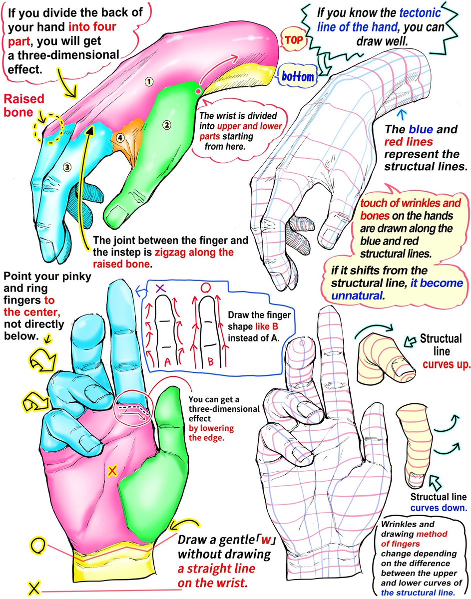
Here’s a pic of a tutorial on drawing hands.
A real short tutorial I did on changing colors in Manga Studio EX 4
Some people on Whitechapel asked for a Perspective tutorial. There’s none better than this one from the Famous Artist’s Course:
facc number 10 Perspective(PDF)
I have Perspective! For Comic Book Artists
And this was recommended by Tommy Patterson It’s $129, but looks like it’s thorough.
Because I’m lazy this week:
50 Clever Tutorials and Techniques on Traditional Drawing | Tutorials | Smashing Magazine
Today I thought I’d give you all a look at some of the tools I use for sketching/drawing.

I, also, use a #3 and #2 round brush for some inking , and various other size brushes for filling in black areas.
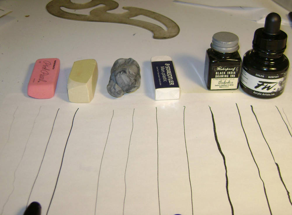
The plastic and kneaded erasers are gentler on paper than the others, and tend to et more use. The kneaded is good for getting into the deeper grooves from my heavy hand.
Those are a couple of the inks I use. I, also like PH Martin’s dye inks, which come in various colors.
So there’s a look at some of the tools I use for drawing. There are others, and I’m always finding new things to use, I find that whatever’s handy works at various times, so there’s no need to spend lots of money if you’re just doing it to have a good time, or whatever

Another Tuesday, some more technique.
The great John K. creator of Ren and Stimpyhas a series on composition for cartoonists and animators. Here is a page with links to each blog post. It’s a good series, and is useful for fine artists who paint realistically, and illustrators, as well as the people they’re aimed at.
Today I’m interested in one post in particular and his small rant on why todays animations are seriously lacking.
Here is an example of what happens so often in the crazy inefficient, wasteful animation production system we have today. There are so many steps in the animation production process, where about 5 different artists all work on the same scene and each one in succession has to draw the same pose that the previous artist drew, and each time the scene gets watered down, until the final scene is completely stiff and lifeless and has lots its original purpose and meaning…
There’s more. The post is about composing your poses together and having characters interact with each other.
He illustrates with examples from animations, and cartoons/comics
He could just as easily used some examples from the fine arts. Such as:

or a couple from Rembrandt:


See how every character reacts to the others? There’s more at the links above, including negative/positive space, etc.
Free art class–what more could you ask for?